Stuffed like a museum coypu with fieldwork last month, January was a vintage period for methodological learnings for me: new experiences and new twists on familiar ones in front of the Great British Public. Unlike the coypu, I’ll be living off the experiences for a while. The first one to muse on is this: how much can you get from purely visual stimulus, with no words?

We tested this to the limits in one set of discussion groups I moderated, whose ultimate purpose was to help some brand teams and their pack designers work out where they could and couldn’t go on pack shapes for their brands. We went in with two sets of stimulus: an image collage board for the brand, which we were testing for fit with public perceptions of the brand; and a set of 20 or so prototype packaging shapes, in the form of 3D plastic models. We wanted them to select for us designs that fitted both the brand values and the image of the brand expressed in the collage board. In the first group of the series, I wrote no words up for them at all – though we did introduce the (verbal) brand values at the end. The discussion was grounded completely in the collage board and the models. So how did that pan out?

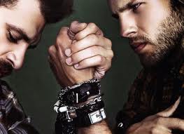
- I know I could talk for literally weeks about this image but only by veering off into the Olympics, the hall carpet in my old house, North Sea oil and the fin de siecle Paris of Toulouse Lautrec. Happily we weren’t discussing this picture, it’s from somewhere else. Thanks to colleterie.com for the image.
It went OK, up to a point, but it was hard work. We’d recruited “creative participants” and on the whole they were great at engaging with the images and giving us the feel we needed as to whether the design agency was thinking along the right lines. They had a good go too at the demanding task of spending 45 minutes or so with 3D models. They found it hard to verbalise at times but they made decisions about them by sorting them into groups and when they ran out of words, they could point to the object of their admiration or disgust and make faces. But I felt – and the (really good) viewing team agreed – that they had run out of puff in places because we’d demanded an awful lot of their visual articulacy.
So for the second group, we tried a twist. We started again with the collage boards and did a good half hour on those still with no words. But this time we then wrote up the brand values one by one and checked these against the visuals. I left them up on the flipchart as we moved into the packaging models section of the group. The result was that it worked a whole lot better.
It seemed the visual reference point of the collage board – strong though it was – was hard for people to translate straight into thoughts about packaging design. They were forming concepts in their heads about what the brand should be, trying to remember that, then going through 20+ models to see both what designs they liked and what best reflected the brand. This was intellectually very difficult for people not used to working in design. The brand values – just a few words – gave them another anchor. Rather than complicating things for them as we had feared, it actually helped them remember the big picture and the objectives of the task.
It’s accepted truth now that people think in “mentalese”, as Steven Pinker puts it, not words. What my design research exercise reminded me was that words are still often a key component of that mentalese. It is hard for people to think in images alone – especially when we are also asking them to articulate the thoughts into words for a group discussion. More was gained here by adding words into the mix than was lost by the potential conceptual confusion of doing that. The groups were still highly visually-driven after we made the adjustment – and we actually empowered participants to take their visual thinking further by giving them this safety net of a few words on a board.
Another little finding: it’s a cliché but it’s true, so-called “metrosexual” blokes are so much easier to moderate in a group than traditional blokes. The project was covering a portfolio of brands. The difference in approach to being male between the buyers of the three main brands was striking. I won’t name the brands, but I was so taken with the easy, open but self-confident rejection of macho values by the buyers of one of the brands that I’m thinking of switching to it myself.

But I’m not talking the Nathan Barley refugees here, I mean ordinary guys in their 40s and 50s who aren’t ostentatious but who “look after themselves” and feel they have nothing to prove to anybody on how male they are. So “metrosexual” may be a misleading word, with its overtones of fashion-chasing urban cool. Perhaps they are that old-new thing from the early 90s, the “New Men”. But this too sounds too flimsy.

These guys have a silverback air of authority and calm. They are more traditionally male than “metrosexual” suggests. But they are men whose thoughts are no longer dictated by testosterone to quite the same degree as before.
They were a joy to moderate. I joked to the brand team afterwards they could just put those guys in an ad and people would get the brand – which has struggled to find an identity – immediately.

