
As a massive London-phile (not sure it’s a word but I can’t stomach asking Boris Johnson what London would be in Ancient Greek), who no longer lives there, I’ve enjoyed on my recent trips into the Smoke the video advertising alongside the Tube escalators. The ads are on to celebrate the London Underground’s 150th birthday this year. Bizarre to think there were tube trains in the steam era but it happened – BBC: London Underground at 150.
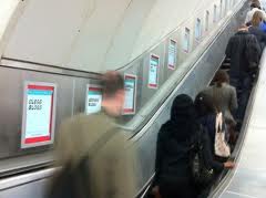
The video ads on the walls by some Tube station escalators show ordinary Londoners from the last 150 years standing next to you. It’s timed so that, individually, each one briefly looks across at you, before facing straight ahead again. A great example of how to make use of video on billboards that really grab your attention without screaming and jumping at you like an over-excited toddler after a packet of Skittles. There’s something about being looked at that makes you look back. Unnerving perhaps at first when, out of the corner of your eye, you think someone might be staring at you; or a little exciting if you think they might be checking you out [yeah, right – have you seen yourself recently? – Ed.] Thought-provoking too, in a gentle way, about how we look at other people and how we feel being looked at; and the Tube as an inanimate witness to the changing styles of the human horde pouring through it.

For anyone interested in branding or semiotics, the London Underground logo is one you just keep coming back to in admiration. It does what many companies spend millions trying and failing to achieve with their visual identity.
It’s instantly recognisable and unmistakable through being both beautifully simple but also charged with meaning. It’s done this by using only two simple geometric shapes; two striking colours; the juxtaposition of curve and straight line, in a symmetrical layout, is both pleasant to look at and creates interesting shapes and angles within the whole; and it can be taken as either purely symbolic in a disembodied way or directly representative (blue River Thames through the red circle of London, blue train against a red and white circular tunnel, or red track as a tube line and the blue line as another intersecting one; and so on). If you want to go further, you can think about the cool blue being the solid engineering of the Tube system itself crossed with the round, red bodily warmth of the human life it transports. The circle too suggests flow and movement, while the rectangle bolted into the middle speaks of something permanent, solid and immovable (like trying to make progress a District Line train at Edgware). The circle could even be the circle of life itself, with the blue as a train connecting one part of our life – and our self – to another part. It could be home and work, love and duty, softness and hardness. Stop me if you think I’m going too far …
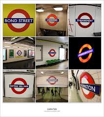 The blue rectangular box across the middle also provides a canvas upon which the logo can be tailored for each place in London with the station name. These local versions of the logo show London as both one place and many places: a collection of smaller localities, but where each is also marked indelibly with the stamp of Londonness.
Most of all, the logo manages to be both distinctive and simple. If you can produce a logo like that in the first place, you can save a lot of money on redesigns over the years. Of course most companies can only dream of their brand getting the kind of ubiquity and prime placement that the Tube logo enjoys. All the more reason to develop a logo that can be instantly and clearly associated with your brand. Getting good brand recognition is only part of the branding task, but done well, it can be a vehicle (excuse the pun) upon which everything else you want to communicate can ride.
Related articles
- London Underground turns 150: Top 10 Tube facts (metro.co.uk)
- Tube: From railway to lucrative brand (bbc.co.uk)
- Tube 150: Ten little-known facts about the London Underground (london24.com)
- 150 Fascinating Facts About The London Underground (telegraph.co.uk)
- 1913 : London Underground Map (retronaut.com)
- 150 facts for 150 years of the London Tube (independent.co.uk)
- A Preview of Poster 150: Celebrating 150 Years of London Underground Posters (newsfeed.time.com)
- What we love about the London Underground (telegraph.co.uk)
- VIDEO: Steam train back on Underground (bbc.co.uk)

